Was doing a bit of moving today and I found a dusty portfolio of studies from 2020 behind my wardrobe (of course) that I had forgotten all about. Found a few that I liked.
The two gouache paintings I actually couldn't help but scan in and rework a tad in Photoshop. The rest are as they were, cheers.
The two gouache paintings I actually couldn't help but scan in and rework a tad in Photoshop. The rest are as they were, cheers.
Had the pleasure of designing and illustrating this hardback edition of 'The King in Yellow' by R.W. Chambers, published by the Bizarchives. Pre-orders available now: https://thebizarchives.com/product/the-king-in-yellow-hardback-preorder/
This was my first ever cover job, so many thanks to Dave Martel for trusting me with this project!
This was my first ever cover job, so many thanks to Dave Martel for trusting me with this project!
Very pleased to finally share my biggest illustration project yet, if you thought that I've been a little quiet this year, here's why.
7 interior illustrations for Ashes of the Necropolis, a dark fantasy sword and sorcery book, by Jordan Allen that releases today, and is available on Amazon. I had a great time illuminating this dark and weird underworld.
Thanks for looking.
https://www.amazon.co.uk/gp/product/1919619267/ref=ewc_pr_img_1?smid=A3P5ROKL5A1OLE&psc=1
Another study in the books, calling this one done. Really enjoyed taking a little breather from projects to try and stay sharp with a little bit of practice.
Before I started this I had originally intended to start in pencil, and then build it up with pen and finally washes of diluted ink but there really is no need.
A good friend of mine and a fellow artist recently told me the Latin phrase "Ars Longa, Vita Brevis" I think it was originally attributed to Socrates, but basically roughly translates to "The art is long or skilfulness takes time but life is short".
So really there is no need to endlessly try and perfect something, I already learnt everything I could from this and made some mistakes (I completely failed to capture the subtle tilt and inclination of the head in the original and the face leaves a lot to be desired for, plus the proportions are off). But that is totally fine, mistakes are part of learning process and should be embraced. If I spent more time trying to make this look better it would only be for self flattery. Time to move on to the next one.
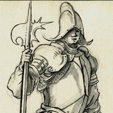
The sculpture is of course St George, attributed to Miccolo Baroncelli and Domenico Di Paris. I saw it in person at the V&A in London last month, and knew I had to draw it.
Pencil in an A5 sketchbook. Thanks for looking.
Before I started this I had originally intended to start in pencil, and then build it up with pen and finally washes of diluted ink but there really is no need.
A good friend of mine and a fellow artist recently told me the Latin phrase "Ars Longa, Vita Brevis" I think it was originally attributed to Socrates, but basically roughly translates to "The art is long or skilfulness takes time but life is short".
So really there is no need to endlessly try and perfect something, I already learnt everything I could from this and made some mistakes (I completely failed to capture the subtle tilt and inclination of the head in the original and the face leaves a lot to be desired for, plus the proportions are off). But that is totally fine, mistakes are part of learning process and should be embraced. If I spent more time trying to make this look better it would only be for self flattery. Time to move on to the next one.
The sculpture is of course St George, attributed to Miccolo Baroncelli and Domenico Di Paris. I saw it in person at the V&A in London last month, and knew I had to draw it.
Pencil in an A5 sketchbook. Thanks for looking.
Just arrived in the post.
Quite a surreal and satisfying moment for me to see something that I spent a fair amount of time, care and attention towards, be realised and become an actual tangible thing in this world.
I'm really looking forward to reading this.
Pick up your copy here: https://www.amazon.co.uk/dp/B0C47NHR41
Quite a surreal and satisfying moment for me to see something that I spent a fair amount of time, care and attention towards, be realised and become an actual tangible thing in this world.
I'm really looking forward to reading this.
Pick up your copy here: https://www.amazon.co.uk/dp/B0C47NHR41
Would you be interested to see more behind the scenes stuff like preliminary sketches and process videos etc?
Anonymous Poll
100%
Yes, show me!
0%
No, don't care!